Small Bathrooms
Paint Colors That Make a Small Bathroom Look Bigger
The best small bathroom paint colors to open up a tight space, from soft whites to pale blues, with tips on finish, ceiling tricks, and color placement.
A quart of paint is one of the cheapest ways to change how a bathroom feels. The right small bathroom paint colors can make a 5x8-foot room read noticeably larger without moving a single wall. The wrong ones can shrink it further. Here is what actually works, and why.
Why Color Makes a Room Feel Bigger or Smaller
Paint affects perceived space in two main ways: light reflectance and contrast.
Light colors bounce more natural and artificial light around the room. A wall painted in a soft white with a Light Reflectance Value (LRV) above 75 sends light to the ceiling, into corners, and back toward you. That diffusion smooths out boundaries and makes the room feel less boxed in.
Contrast works the opposite way. When walls, trim, and ceiling are all different colors, your eye reads each surface as a separate plane. The room splits into pieces, and you register each one as a limit. Reduce the contrast between surfaces and the room blurs together into something that feels more continuous.
Small bathrooms also tend to have less natural light than other rooms. A color that looks airy in a showroom can go muddy in a windowless bath once the overhead fixture is the only light source. Always check paint chips under the actual lighting conditions before committing.
Light Colors That Work Best for a Small Bathroom
Most small bathroom color ideas circle back to the same fundamental principle: go lighter than you think you need to.
Soft White and Off-White
True bright white is not always the answer. It can read as sterile, and any yellowing from age or humidity becomes obvious fast. Soft whites with a slight warm or cool undertone (LRV 80 to 90) tend to work better. They are still highly reflective but feel livable rather than clinical.
Off-whites with a barely-there greige or cream undertone are especially forgiving in bathrooms with warm wood tones or brass fixtures. A cool off-white works well with chrome and white subway tile.
Pale Gray and Greige
Light gray has been a reliable small bathroom staple for years, and for good reason. A pale gray with LRV around 70 to 78 reads as neutral without being stark. It pairs well with both cool and warm fixtures, and it does not show every water spot on painted drywall the way a very light color can.
Greige (gray-beige blends) sits in a similar range. If your bathroom has warm tile or natural wood shelving, greige often reads better than a true gray because it does not fight those warm tones.
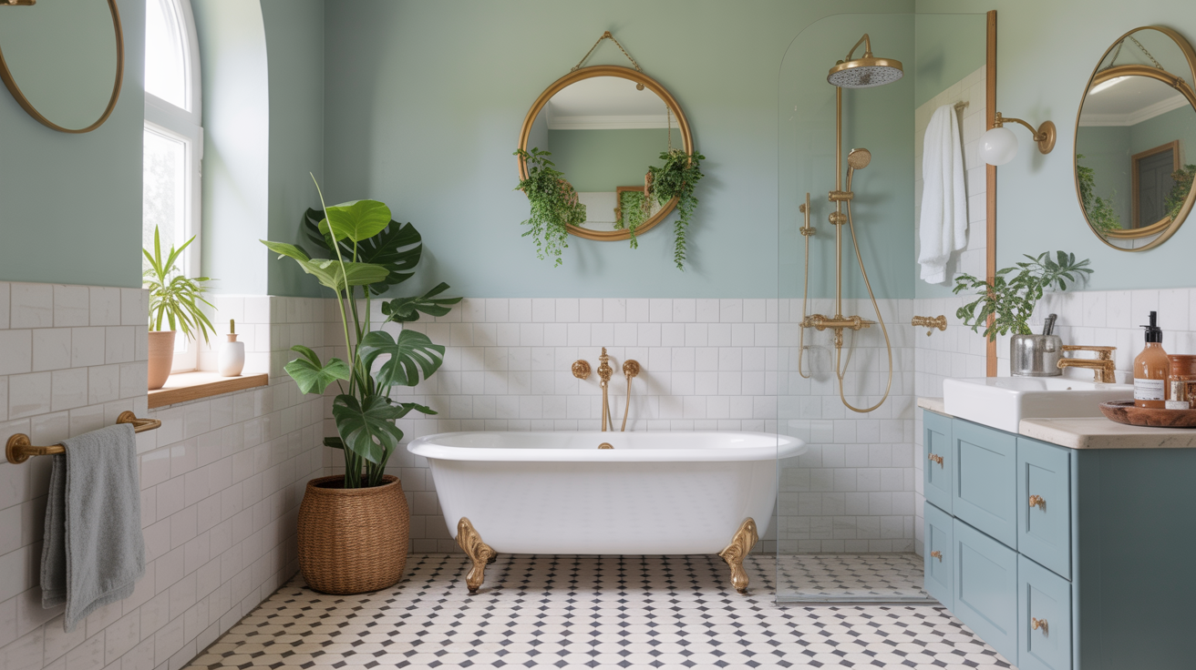
Light Blue and Aqua
Pale blue is one of the strongest light bathroom colors for a reason that goes beyond trend. Blue is a receding color, meaning the eye reads it as slightly farther away than it actually is. That visual recession makes walls feel like they are stepping back. A soft sky blue or dusty aqua (LRV 60 to 70) can give a small bathroom a sense of depth that neutrals do not always create.
Cooler blues work especially well in bathrooms with white tile, brushed nickel, or chrome. Warmer aqua tones with a hint of green bridge better with aged brass or unlacquered fixtures.
Muted Sage and Pale Green
Sage and pale green have moved from trend to reliable category over the past several years. Light muted greens sit in the same middle zone as blue: they recede slightly and feel calm. They also work well with white grout, natural stone tile, and wood vanities.
The key word is muted. A saturated green will close a space. A pale, slightly gray-toned sage at LRV 55 to 65 reads as sophisticated without dominating the room.
How to Use Color Placement to Add Visual Space
The shade you pick matters, but where you put it changes the effect as much as the hue does.
Paint the Ceiling the Same Color as the Walls
Painting the ceiling a slightly lighter version of the wall color (or the exact same color) removes the horizontal line where wall meets ceiling. That line, when it exists as a contrast boundary, is one of the things that makes a low ceiling feel low. Blur it out and the room reads taller.
A common approach: walls in a soft blue-gray, ceiling in the same color lightened by 50 percent. The transition is nearly invisible, and the ceiling appears to float.
Keep Trim Close in Value
Brilliant white trim against a medium-toned wall is a classic look, but it chops the room into horizontal bands. If you want more visual continuity, paint the trim the same color as the walls or just one shade lighter. The room reads as a single envelope rather than a collection of framed panels.
This does not mean trim disappears. A slight sheen difference (satin walls, semi-gloss trim) gives you the definition without the high-contrast boundary.
One Painted Accent Wall
If you want to try a deeper color without wrapping all four walls in it, a single accent wall behind the vanity or toilet can work. The key is to avoid making the painted wall the one directly opposite the entry. That placement draws the eye to the back wall, which emphasizes the room's depth, but it can also make the far end feel like a dead stop.
A side wall or the wall behind built-in shelving tends to add dimension without making the room feel compressed.
Paint Finish Choices for Bathrooms
Finish is not just about sheen. In a bathroom, it determines how well the surface holds up to humidity, steam, and cleaning.
Eggshell is a common choice for bathroom walls. It has a slight sheen (about 10 to 25 percent gloss), wipes clean without showing every touch, and does not highlight surface imperfections the way semi-gloss can.
Satin works well for bathrooms with higher humidity or heavy daily use. The sheen is more noticeable, but it resists moisture better than eggshell and is easy to wipe down.
Semi-gloss is standard for trim, door frames, and cabinet fronts because it holds up to scrubbing. It can work on walls in a very small bathroom, but the reflectivity under direct light can feel harsh.
Flat or matte paint is generally not recommended for bathrooms. It does not hold up to moisture or cleaning well.
See small bathroom storage ideas that save space for more on making a tight footprint work harder once the walls are sorted.
Colors to Use Carefully in a Small Space
A few categories tend to create problems, though none are absolute rules.
Saturated warm colors (terra cotta, deep ochre, burgundy) advance visually, meaning they feel closer than they are. In a small room this can feel cozy or claustrophobic depending on context and lighting. If you want warmth, lean toward lighter, muted versions of these tones rather than full saturation.
Very dark colors read differently in person than they do online. A charcoal or navy bathroom can look stunning in a large, well-lit space but overwhelming in 35 square feet with one window. That said, dark colors used strategically on one wall or in a bathroom with high ceilings can create drama without feeling oppressive.
High-chroma mid-tones are often the trickiest. A medium green or mid-range teal is not dark enough to feel intentionally moody and not light enough to open the space. The result can feel muddy, especially in artificial light.
For more on planning the overall feel of the space before picking paint, small bathroom ideas to make it feel bigger covers layout and visual tricks that work alongside color.
Frequently Asked Questions
What is the best paint color for a small bathroom?
There is no single best color, but soft whites, pale grays, and light blues consistently perform well because of their high light reflectance and visual recession. The best choice depends on your fixture finishes, tile color, and natural light. Aim for an LRV above 65 for walls and check the color under your bathroom's actual lighting before committing to a full gallon.
Does white always make a small bathroom look bigger?
Generally yes, but not all whites are equal. A very warm or very cool white can clash with tile undertones and look dirty rather than crisp. Soft whites with LRV values in the 80 to 90 range and a subtle neutral undertone tend to work better than stark bright whites, which can feel cold and institutional in small spaces.
Can I use dark colors in a small bathroom?
Yes, but context matters. A dark color on all four walls in a tiny windowless bathroom is a difficult room to make work. A single dark accent wall, or dark color in a bathroom with above-average natural light and high ceilings, is more manageable. If you want to try it, paint one wall first and live with it through different times of day before committing.
Should the ceiling be the same color as the walls?
Painting the ceiling the same color as the walls (or a slightly lighter version) removes the line where they meet and makes the room feel taller. It works especially well with light to medium wall colors. If you have patterned tile or bold fixtures, a white ceiling can give the eye a neutral place to rest, which is also a valid approach.
What paint finish should I use in a bathroom?
Eggshell or satin for walls, semi-gloss for trim. Eggshell handles light moisture and is easy to wipe, while satin holds up better in high-humidity bathrooms. Avoid flat or matte paint on bathroom walls as neither stands up well to steam, cleaning products, or general dampness over time.
For a broader look at how layout decisions interact with color and storage, the best layouts for a small bathroom walks through the spatial planning side of small bath design.